


Revalo · Zaelot
Designing clarity in geospatial systems
The map is the ground. Everything else is a sheet drawn over it.
Two years bringing structure to a US land intelligence app that had grown into a collection of features. The last 18 months as its only designer.
Shipped on iOS in June 2026 with two subscription tiers, on a structure that held as features kept arriving.
- Role
- UX/UI designer, then only designer
- Context
- Client product, at Zaelot
- Platform
- iOS
- Duration
- Two years, 2024 to 2026
- Team
- 10 people building from the designs
- Scope
- Product structure, data experience, design system
- Live
- revalo.io ↗
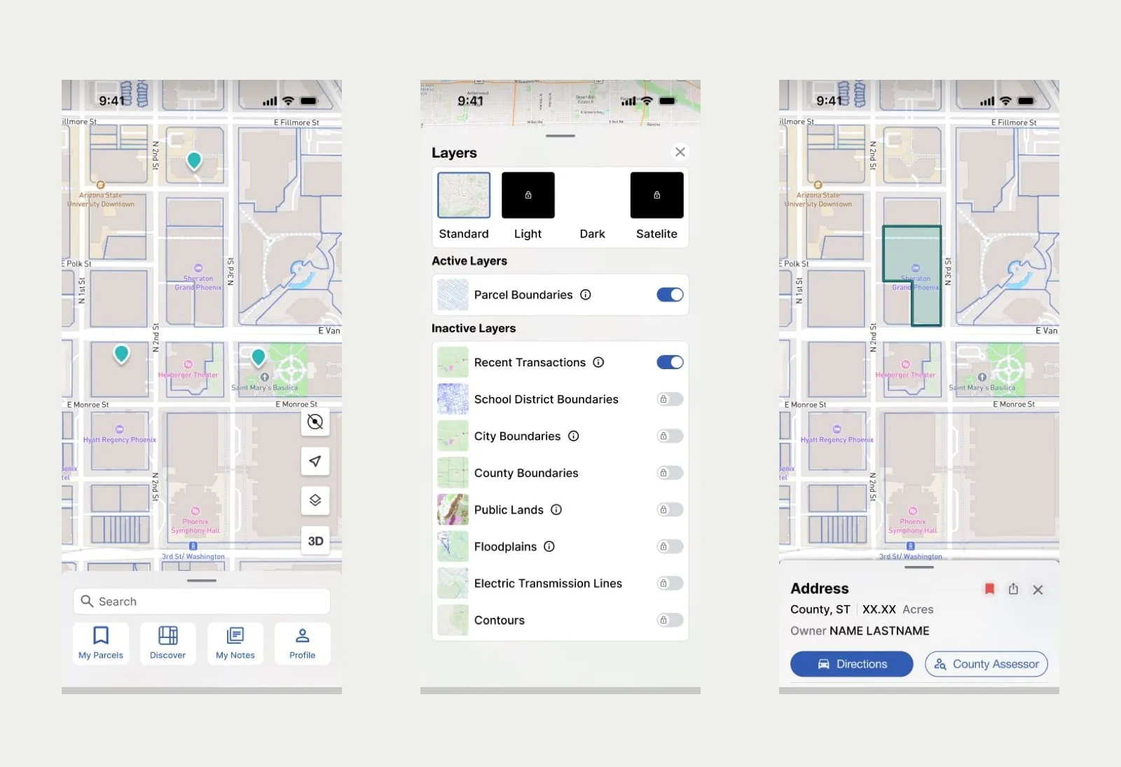
- 01OverviewIdentity first: county, acreage, owner, directions, and a link to the assessor's own record.
- 02FinancialThe heaviest load, so it earned a view instead of a section. Transactions, taxes, four valuations.
- 03LocationSpatial context, kept separate so it does not compete with the money questions.
- 04Flood RiskHazard exposure as a peer of financial data, not a footnote at the bottom of a list.
The product
Revalo lets you explore and analyze land parcels across the United States. You open a map, tap a parcel, and get the record behind it: who owns it, what it last sold for, what it's assessed at, what the taxes are, where the flood risk sits, what's being built nearby.
The complexity is real. Eight togglable data layers, from parcel boundaries and contours to electric transmission lines and floodplains. Four base maps. A parcel record spanning ownership trusts and mailing addresses, transaction history with dates and deltas, assessed valuation, land market value, improvement value, price per square foot and tax area codes.
The people using it make decisions about property with money attached, so the job was to make the data legible enough to act on.
How I ended up owning it
I joined through Zaelot to assist Marcela Abal, the designer leading the product. For the first six months we defined the work together, and for a stretch I designed the website while she designed the app. The client asked to keep me on. When Marcela moved to another product, I stayed with this one, and for the last 18 of 24 months I was its only designer, with ten people building from the designs.
The problem
Capabilities had arrived one at a time and been designed one at a time. The result was fragmented navigation, inconsistent interfaces, and no mental model a user could carry from one part of the app to another. In the design files that looked like the same feature explored in two places, five competing proposals for map interaction, and a parcel record that had collected fields faster than anyone had organized them.
01The map is the ground
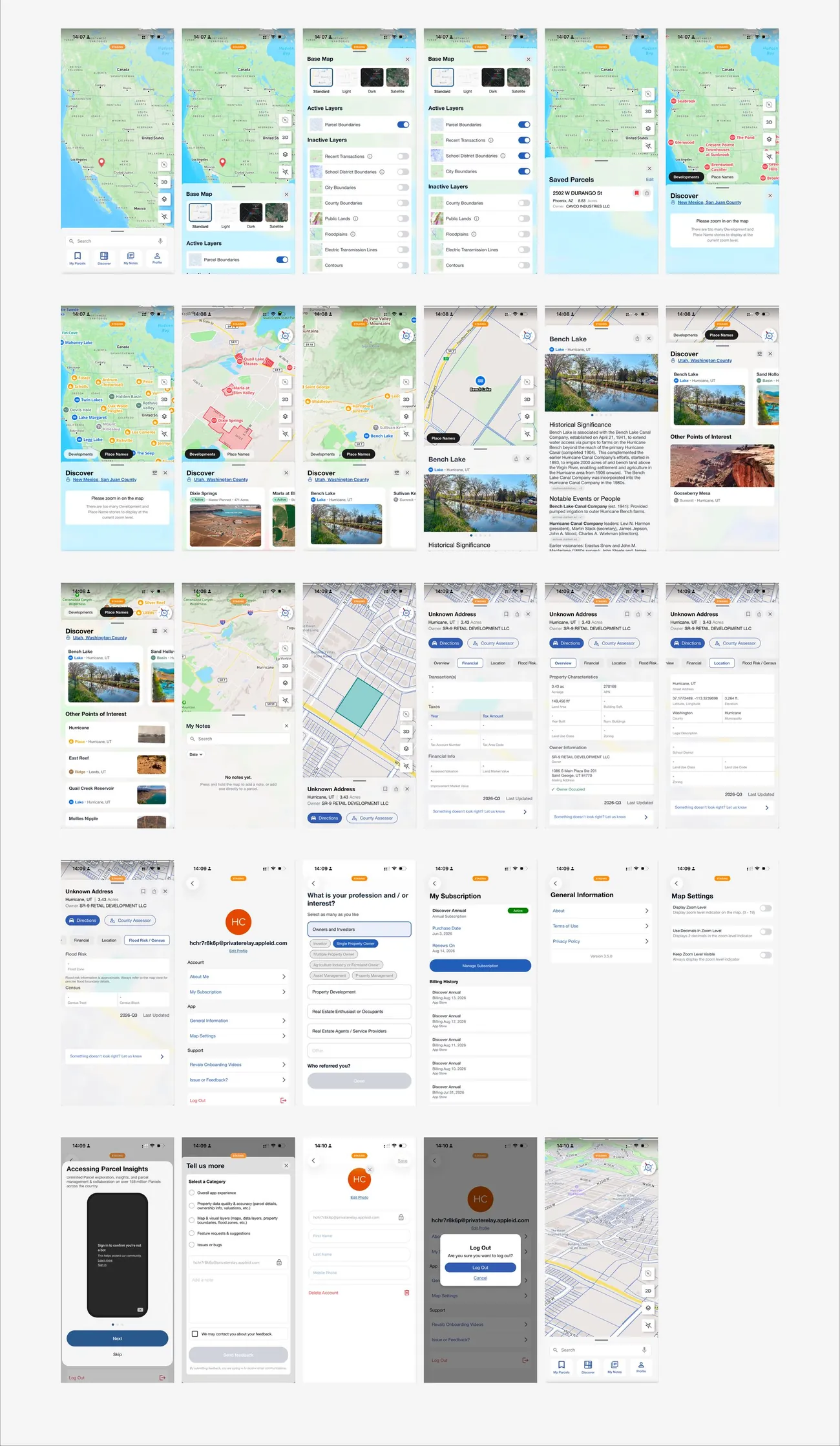
The organizing decision. Instead of treating the map as one destination among several, it became the persistent ground the product sits on. Search, the layer panel and the parcel record are sheets drawn over a map that never goes away, so context is never lost and no transition costs a person their place.
- Searchregion-scoped
- Layersbase + data
- Parcel record4 views
- Notespins
- Saves
- Discover
- Feedback
02Sixty fields, four questions
The parcel record was the center of gravity and the most rewritten screen in the project. Roughly a quarter of all the design work sat on it, and I rewrote it fifteen times. Presenting everything the county knows as one list made all of it equally unimportant.
The restructure grouped fields by the question being asked rather than by where the data came from. Four views, each answering one thing, with the header carrying identity and the two actions people actually wanted: directions to the parcel, and the assessor's own record.
03Three kinds of layer, three rules
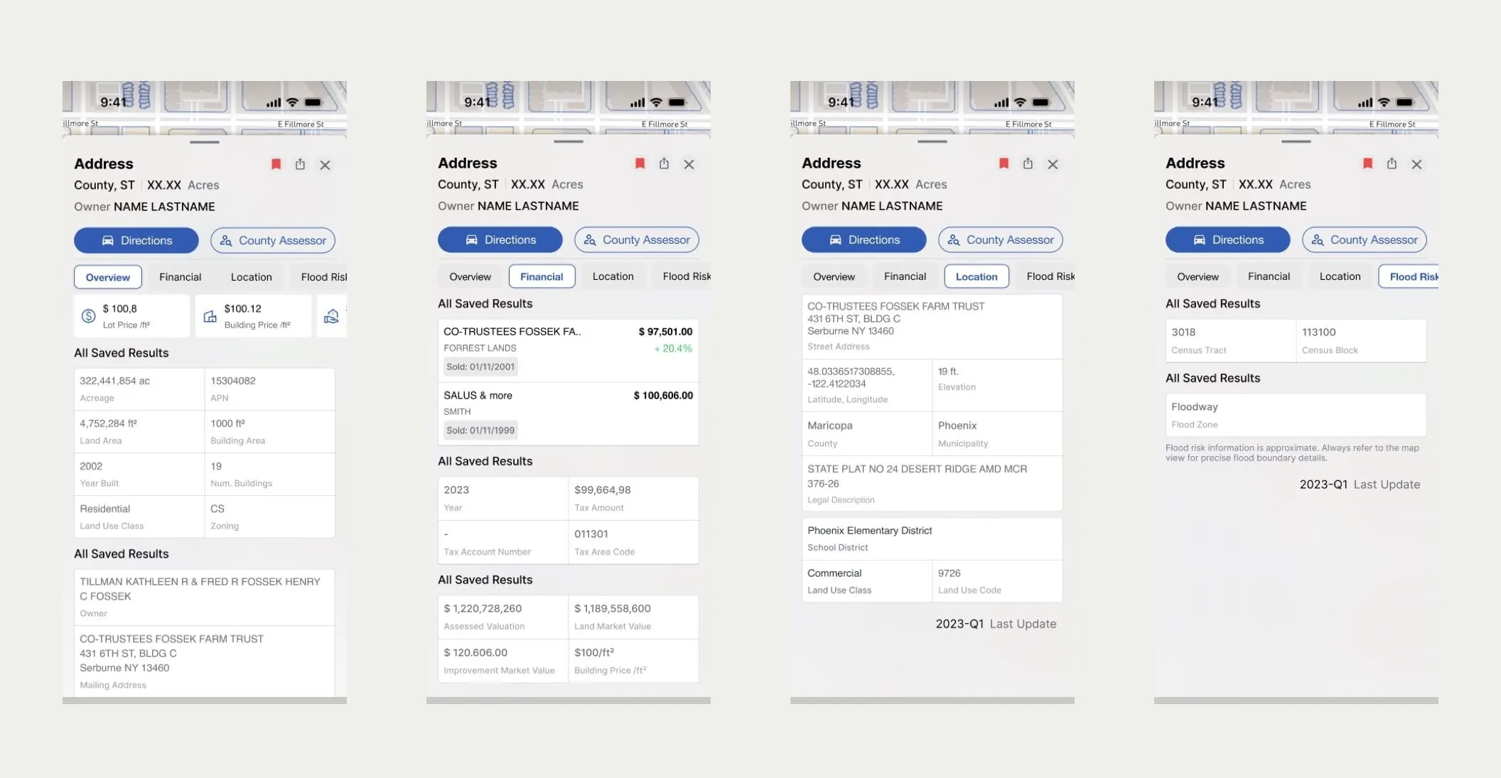
Layers had been one undifferentiated list, which hid the fact that different layers behave differently. Base maps are mutually exclusive, you get one. Data layers are additive and independent. Interaction layers resolve against whatever is currently drawn.
Naming the three tiers made the panel designable. It also showed which layers need explaining, because Public Lands or Floodplains mean something specific and legally loaded that a user should be able to check.
- Base mapPick one
- Default
- Light
- Dark
- Satellite
- Data layersStack freely
- Parcel Boundaries
- City Boundaries ⓘ
- School Districts
- County Boundaries
- Public Lands ⓘ
- Floodplains ⓘ
- Transmission Lines
- Contours
- InteractionResolves against what's drawn
- Crosshair
- Long press
- Measure
- Multiple selection
- 3D

An earlier version split layers into active and inactive groups, so toggling a layer moved it to another part of the list and the thing you had just touched jumped away from your finger.
Fixing the order and lifting base maps into a visual picker cost nothing and removed the whole problem.
04Two intents, one input
Search was carrying two unrelated jobs. Someone typing an address, an APN or an owner name already knows what they want and needs to be taken there. Someone scanning a region wants to be shown what is there, and no query expresses that.
Splitting them let each become good at one thing. Search gained region scoping and input detection, so the field recognizes what kind of identifier it has been given. Discover became its own mode: filtered pins, development cards with status and acreage, and 3D.
Before
One search field- Lookup and exploration at once
- No way to say "show me what's here"
- Ambiguous across identifier types
Targeted
Search- Address · APN · owner name
- Region-scoped by default
- Detects the input type
Exploratory
Discover- Developments and place names
- Cards with status, type, acreage
- Points of interest, 3D
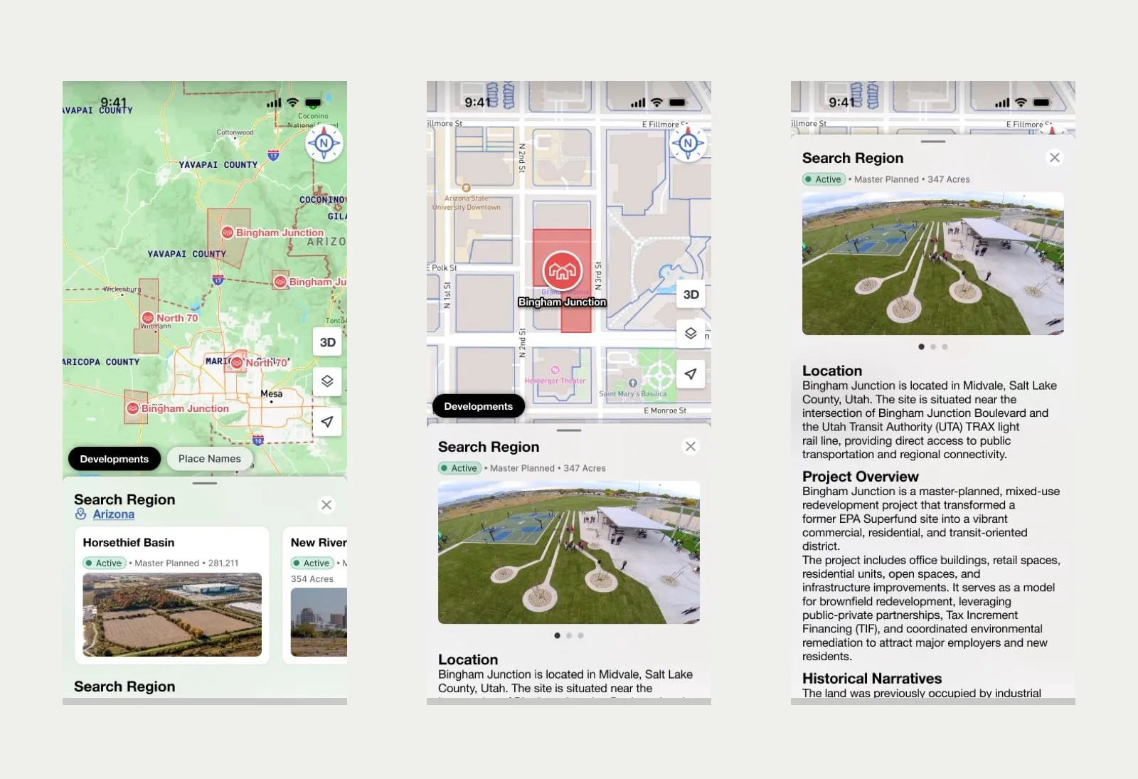
05Designing toward what Mapbox does natively
In Discover I had first designed points on the map that rendered as images. The product runs on Mapbox, and the honest answer there was pins. I learned enough Mapbox to know how far it could be customized, and redesigned toward what the platform does natively.
06One library instead of two loose files
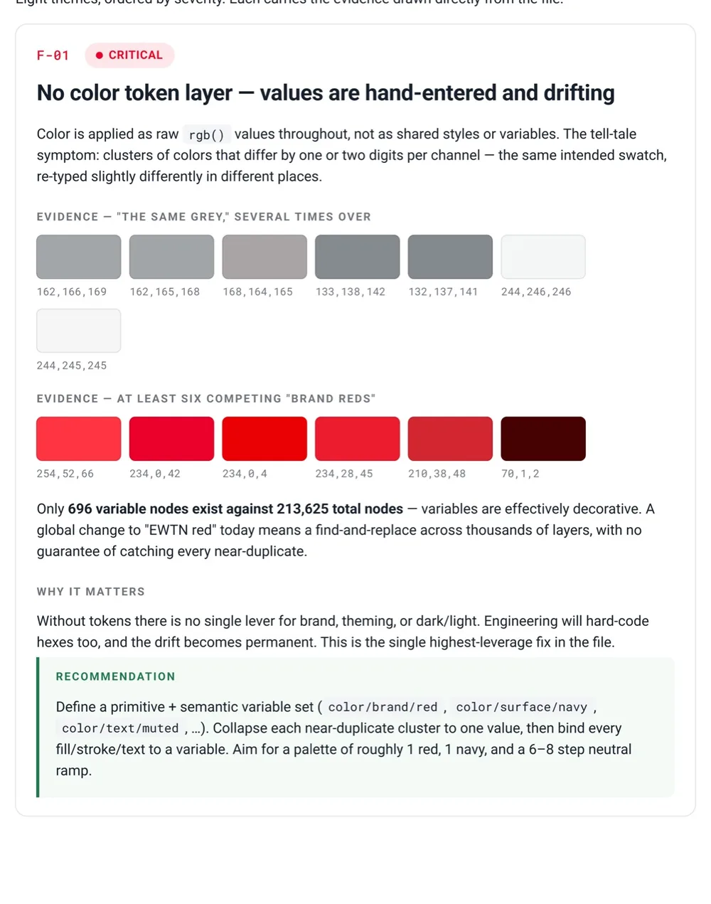
When I took over there was an in-progress file and a ready-for-dev file, both loosely componentized. I unified them into one linked component library plus a workspace where a screen was sealed once it was ready. Color, spacing and radius became tokens that components bind to, and by handoff 989 components were bound to those variables. For the team that meant specs nobody had to interpret, and the same decisions on every screen.
The clearest piece of that work: 243 icons had accumulated under six naming conventions, including Material export filenames and about thirty auto-generated names that meant nothing. Finding an icon meant remembering where it came from.
Six conventions
baseline_edit_black_24dpowner_names_mapmdi:map-marker-altic:round-searchBookmark OutlineProperty 1=Icons
One schema
Category = actionIcon = edit243 icons · 23 categories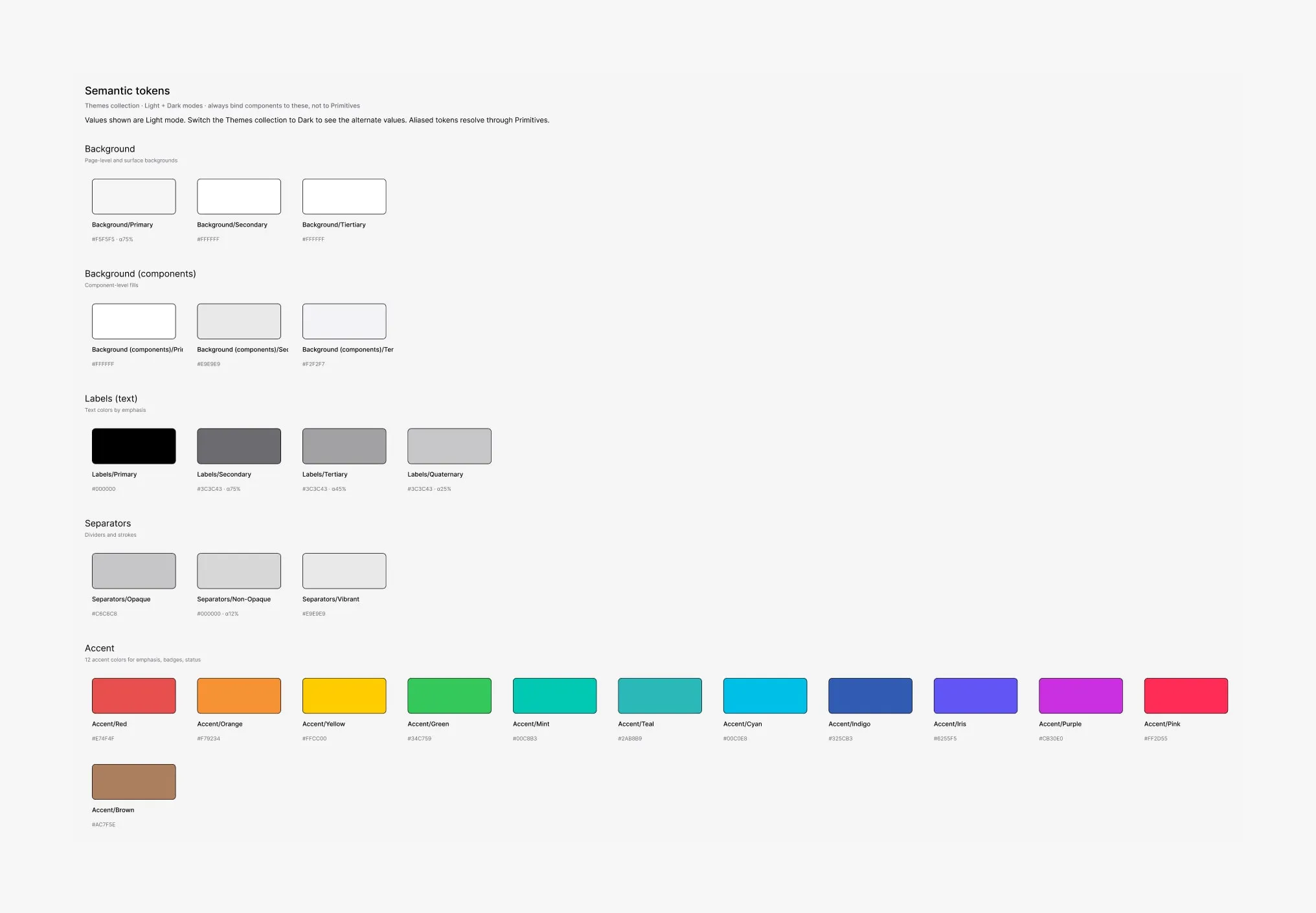
07Making handoff survive time
The pipeline existed to guarantee that what a developer built was the state that had actually been reviewed, and that anyone returning to a ticket months later would land on the same thing.
- One ticket, one sectionWork happens as a Figma section inside the feature's page, in a work-in-progress zone.
- Promotion is gatedThe feature page moves to handoff only when every section carries a ready-for-dev status.
- Refinement is versionedAfter each refinement meeting, a named, dated file version is saved with the tickets it covers.
- The version returns to the ticketThat link goes back into the ticket, so future work opens exactly the state that was agreed.
What shipped
The app shipped on iOS in June 2026 and is live at revalo.io, with two subscription tiers gated through RevenueCat: restricted layers, gated parcel information and 3D mode, a cap on saved parcels, and owner search behind the paywall.
It was late. The paid launch was planned for August 2025 and moved three times, while the product kept adding surface: notes, Discover mode, new map layers, and a story mode that generates a narrative from parcel data. The structure absorbed all of it. New work landed in one of its slots instead of becoming another destination.
What I would do differently
We never tested any of it. No interviews, no usability sessions, no metrics, no iteration loop. Every structural decision here, including the ones I still believe in, rests on reasoning rather than evidence.
The product also kept adding features instead of finishing the ones it had. Parcel detail, the screen that mattered most, never got the usability pass it needed.
I would sequence it differently: about three months of design, six months building what was designed, and then testing it in the market. And I would spend the first month talking to users instead of organizing screens.
Credits
- Design: Marcela Abal, then Marcela and me, then me
- Product owners: Anthony, then Ethan and Nate
- Product managers: Mateo López, then Gustavo D'Andrea
- Development: Manuel Acuña, Aquiles Mariani, Jorge Zammit
- QA: Natalia Antinori, Jorge Perozo, Vladimir Ostapoff
- Delivery lead: Emmanuel Calle · Data architect: Bruno Cerecetto